Halftone and dither
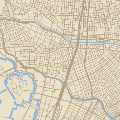
Modern maps have millions of colours. Print did not, and the techniques it used to cope — halftone screens, limited inks, dithering — are a look. The palette ops give it to you directly.
Dither to a fixed palette
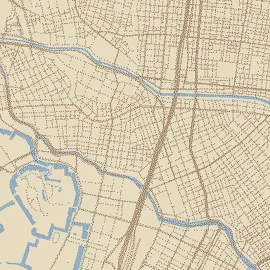
Section titled “Dither to a fixed palette”"riso": { "op": "dither", "input": "@composite", "palette": ["#0c1b33", "#f5f0e6", "#e04a3f", "#4a7bb7"], "method": "floyd-steinberg", "space": "lab"}method: "floyd-steinberg"(default) diffuses quantization error to neighbouring pixels. Organic and non-repeating — closest to a photographic reproduction. It is inherently scan-ordered, so keep it for single images and bbox renders rather than pyramids where you will study the seams.method: "ordered"uses a 4×4 Bayer matrix, withamount(0–1) setting strength. Regular, screen-like, position-deterministic — the choice for tiles.spaceislab(default, perceptual nearest-colour) orrgb(numeric). Lab is nearly always right; rgb is faster and sometimes harder-edged.
Alpha is preserved, so a dithered layer still composites.
Reduce without dithering
Section titled “Reduce without dithering”"flat": { "op": "posterize", "input": "@composite", "steps": 4 },"inks": { "op": "quantize", "input": "@composite", "palette": ["#0c1b33", "#f5f0e6", "#e04a3f"], "space": "lab" }posterize snaps each channel to steps levels — banding, deliberately.
quantize maps every pixel to its nearest palette entry with no error diffusion:
flat, graphic, cheaper than dither. Same palette, very different feel — dither
keeps gradients readable, quantize destroys them on purpose.
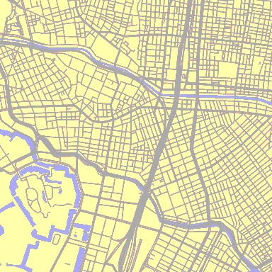
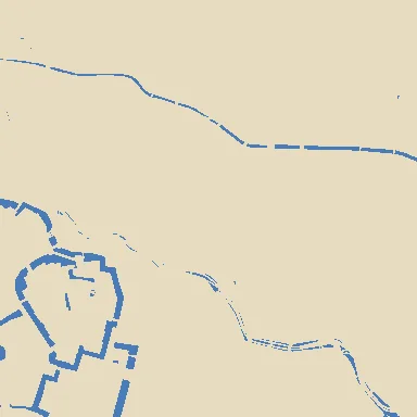
posterize (left) bands each channel; quantize (right) snaps to a palette. Neither diffuses error, so both go flat.A newsprint stack
Section titled “A newsprint stack”"grey": { "op": "hsl", "input": "@composite", "saturation": -1 },"boost": { "op": "levels", "input": "@grey", "in-black": 0.15, "in-white": 0.85 },"dots": { "op": "dither", "input": "@boost", "method": "ordered", "amount": 0.8, "palette": ["#111111", "#f7f5ef"] }Desaturate, expand the tonal range so the two-colour screen has something to bite
on, then screen. The levels step is the one people skip, and it is the difference
between legible and mud. levels also takes gamma, out-black, and out-white
if you want to lift the blacks the way ink on newsprint does.
Halftone blocks
Section titled “Halftone blocks”mosaic averages the image into square blocks, which is a coarse screen:
"screen": { "op": "mosaic", "input": "@composite", "block": 4, "anchor": "world" }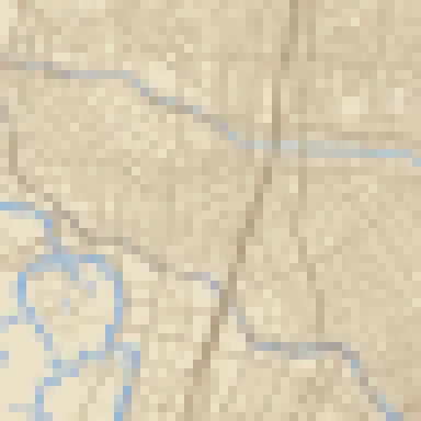
anchor: "world" keeps the block grid continuous across map tiles, at the cost of
extra padding; anchor: "tile" restarts the grid at each tile’s corner and needs no
padding — fine for a single image, visible as a grid-of-grids in a pyramid.
mode: "nearest" samples each block’s centre instead of averaging, for hard blocks
with no colour blending.
Plate wobble
Section titled “Plate wobble”Print looks convincing partly because the plates are never perfectly registered.
displace pushes pixels around according to a displacement raster, so
low-frequency noise gives a gently misregistered plate:
"wob_src": { "op": "noise", "scale-px": 64, "octaves": 2, "anchor": "world" },"wobbled": { "op": "displace", "input": "@composite", "displacement": "@wob_src", "amp-px": 1.5, "boundary": "mirror" }Keep amp-px under about 2. More reads as a bug; less is invisible. anchor: "world" on the noise is what keeps the wobble continuous across tiles — see
tiles and determinism.
Where in the graph
Section titled “Where in the graph”Palette reduction belongs at the end, over the finished composite, for the same reason a print shop screens assembled artwork rather than each element: dithering per layer and then blending gives you dithered dithering, and the palette stops meaning anything.
The exception is when one layer should look printed on an otherwise smooth map — then dither that layer alone and blend it over.
Padding is computed across the whole chain, so you never add it up by hand; but if
edges look wrong after adding displace or a world-anchored mosaic, pad is the
first thing to check.
A worked example
Section titled “A worked example”risograph.json
puts the whole chapter together: a masked point-grid screen over the area fills,
solid linework, drums knocked out of register with transform, and one closing
quantize onto the ink palette. See it rendered in the
gallery.
Map renders on this site are made fromOpenStreetMap data viaProtomaps (© OpenStreetMap contributors), elevation from Re:Earth Terrain,Mapterhorn andEGM2008 (NGA), and aerial imagery from GSI Japan(© 国土地理院). The painterly styles use CC0 brushes byDavid Revoy.